Working with Templates on SharePoint On-Premises
-
In the browser, navigate the root site > Global Nav List folder and select the + New button to create your global navigation menu.
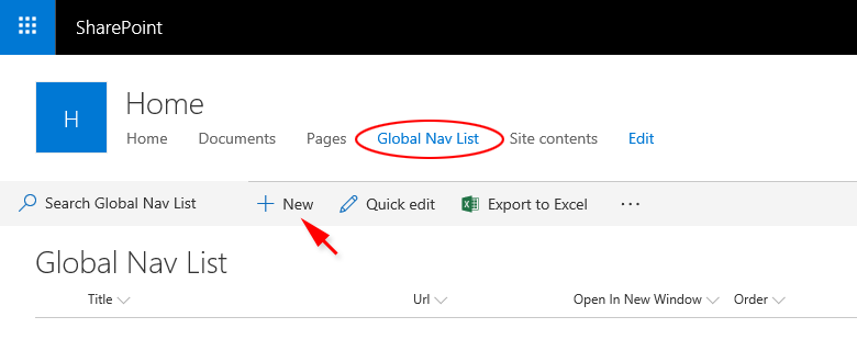
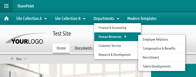
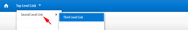
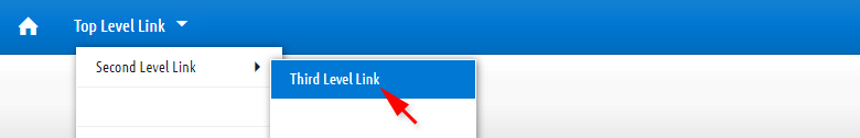
*Example of the global navigation menu (click the image to see the menu in action)
-
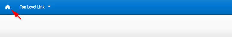
To create the "Home Icon", for title enter Home, for order enter 1, and for parent select (None).
-
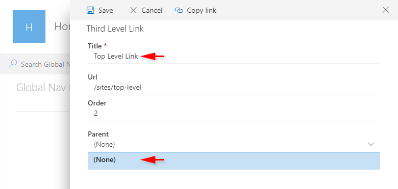
To create a "Top Level Link", for title enter any text you need, for order enter different number than 1, for parent select (None).

-
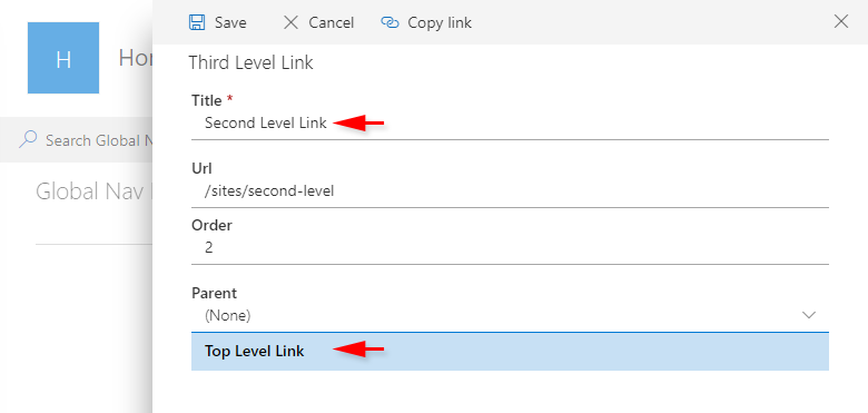
To create a "Second Level Link", for title enter any text you need, for order enter different number than 1, for parent select one of your top level links.
-
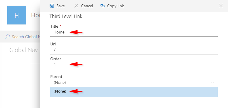
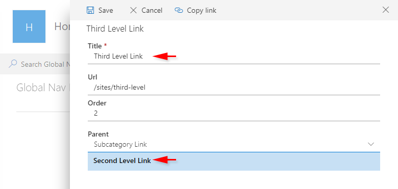
To create a "Third Level Link", for title enter any text you need, for order enter different number than 1, for parent select one of your second level links.
-
Navigate to:
Your SharePoint Local Disc: Program Files\Common Files\Microsoft Shared\Web Server Extensions\16\TEMPLATE\LAYOUTS\1033\STYLES\Themable > "mt-on-prem" folder. - Rename the globalnav-ON folder to globalnav-OFF.
Disabling and Enabling the Global Navigation
To TURN OFF the global navigation:
To TURN the footer back ON, rename the folder globalnav-OFF back to globalnav-ON.
The collapsible footer is attached to SharePoint sites by applying the Modern Duotones or the Modern Monotones SPFx theming solution (via 'Add an app'). The content of the collapsible footer is served from the MasterThemes Assets site on your O365 Tenant. The collapsible footer is enabled by default. It can be disabled if needed.
Important Note*
In order to edit the collapsible footer, you need to be a member of the MasterThemes Assets site collection.
In order to disable the collapsible footer, you need to be an administrator of SharePoint 2019 server.
- Open the MasterThemes Assets site in SharePoint Designer 2013, expand the Site Assets folder.
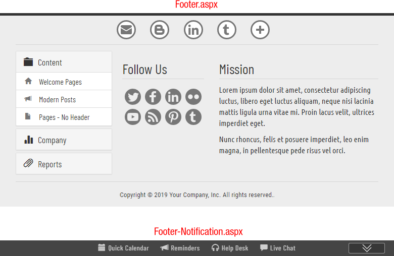
- In the Site Assets folder, navigate to MT-Footer > Footer-Edit folder.
- Open the Footer.aspx and Footer-Notification.aspx files to make edits.
-
Provide changes to each section between <!-- B E G in --> and <!-- E N D -->
-
After your changes are complete, save the Footer.aspx and Footer-Notification.aspx files.
Modifying Footer Content
The collapsible footer consists of two files: Footer.aspx and Footer-Notification.aspx. To modify the footer content, you need to edit both files:
To edit the footer content using SharePoint Designer 2013:
<!--  B E G in -->
   <div>
      Footer Content
   </div>
<!-- E N D -->
Note*
You can use any editor to modify the footer's source code. You can start by opening the Footer.aspx and Footer-Notification.aspx files from the MT-Footer folder located in the extracted YourPackage.zip file, making edits, and uploading them using your browser to the MasterThemes Assets site > Site Assets > MT-Footer > Footer-Edit folder.
-
Navigate to:
Your SharePoint Local Disc: Program Files\Common Files\Microsoft Shared\Web Server Extensions\16\TEMPLATE\LAYOUTS\1033\STYLES\Themable > "mt-on-prem" folder. - Rename the footer-ON folder to footer-OFF.
Disabling and Enabling the Footer
To TURN OFF the footer:
To TURN the footer back ON, rename the folder footer-OFF back to footer-ON.
The Modern Page Templates enclosed in this package are delivered as predefined layouts with preformatted dummy content for quick and easy creation of professional pages. They are intended for use in three categories:
- Welcome Page Templates:
- Home-Carousel-A.aspx
- Home-Carousel-B.aspx
- Home-Showcase-A.aspx
- Home-Showcase-B.aspx
- Hom-Showcease-C.aspx
- Home-Topic-A.aspx
- Home-Topic-B.aspx
- Post Templates:
- News-Post-A.aspx
- News-Post-B.aspx
- News-Post-C.aspx
- News-Post-D.aspx
- News-Post-E.aspx
- News-Post-F.aspx
- News-Post-G.aspx
- News-Post-H.aspx
- Internal Page Templates:
- Page-No-Header-A.aspx
- Page-No-Header-B.aspx
- Page-No-Header-C.aspx
- Page-No-Header-D.aspx
- Page-No-Header-E.aspx
- Page-No-Header-F.aspx
- Page-No-Header-G.aspx
- Page-No-Header-H.aspx
After the Modern Page Templates are added to your site (see Installation of Modern Page Templates on SharePoint SharePoint On-Premises 2019), to create a New Page from the selected template:
-
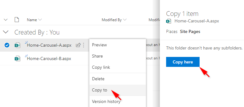
Open the Site Pages library, right-click the template you want to use > select Copy to > select Copy here from the right pane to make a copy of the file.
-
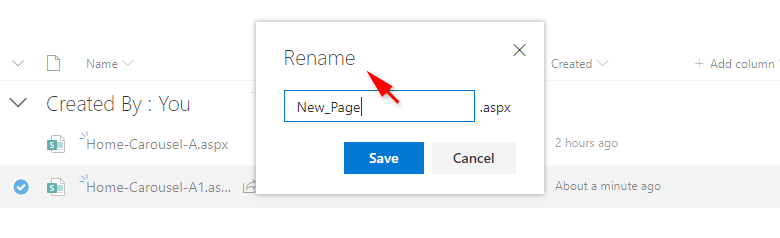
Right-click the copied template and rename it as needed.
- Open the New_Page.aspx by clicking it, and start providing edits.
To provide edits to the text, all you need to do is to highlight sections of the dummy text and enter your own text within the highlighted sections. The same method applies to the modification of links in templates. Highlight the link text, enter new link text, and change the address of the hyperlink.
To change the image used in the template, in the edit mode select the image you want to change, click edit web part icon, and then select the Change Image button to select the image you want to use.
The templates contain many sections in which image groups are used as image galleries (configured as tiles or carousel displays). These image groups are pre-set for image sizes, aspect ratios, and time factors for image sliders.
To change groups of images in image galleries, do not delete the current image groups (pre-sets) used in the templates. Instead, first add your own images to the image groups (pre-sets), and then delete the images you don't want to use. This way, all settings will be preserved and applied towards the images you added.
To modify the contents of the accordion component, follow the instructions Accordion - Embedding and Modifications under Contents to Embed.
To modify the contents of the carousel, follow the instructions Carousel - Embedding and modifications under Contents to Embed.
Except for the carousel enclosed in the Home-Carousel-A.aspx template, the slider can be embedded on any of your pages, and moved from one layout section or column to another. You can freely change the position of the carousel enclosed in the Home-Carousel-B.aspx template, since it is embedded within the "non Full-width column" section.
Important Note for Carousel A*
Important Note*
To apply a custom color (a single primary color) to modern site on SharePoint 2019 On-Premises:
-
Install classic *.spcolor themes:
- Go to the extracted package (YourPackage.zip), expand the Color_Palettes folder, select all *.spcolor files located in that folder (Ctrl+A), and copy them to your clipboard (Ctrl+C).
- Open http://YourSharePointSite (your top-level site) in SharePoint Designer 2013, click All Files (left pane), and expand _catalogs/theme/15 directory (right pane).
- Paste the files from your clipboard into catalogs/theme/15 directory.
-
Apply a custom color to your site:
- Open http://YourSharePointSite (your top-level site) in the browser.
- Select the gears icon form the suite bar area > select Change the look.
- At the bottom of the Change the look panel select Classic change the look options.
- Select Current thumbnail preview > expand Colors dropdown list > select one of the 14 color options couting from the top of the list > select Try it out > Yes keep it.
The first 14 color palettes from the list are the custom color palettes predefined for MT-Modern-OnPrem-01 and MT-Modern-OnPrem-02 apps.
Our SPFx theme package solution allows you to use a larger and more prominent brand logo on communication sites in comparison to modern out-of-the-box templates that limit the site's logo dimensions to a squared shape of 64 x 64 pixels. After installation of the SPFx theme package solution, the size of your logo can have up to 175 pixels in width. For more information on Logos, follow Instructions on Logos for Modern Sites.